In conversation: Umut Yamac
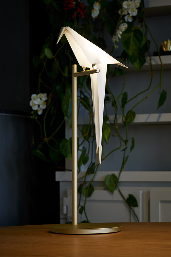
Elegant, unexpected and truly beautiful - today we put the spotlight on the captivating Perch Light, designed by Umut Yamac for Moooi.
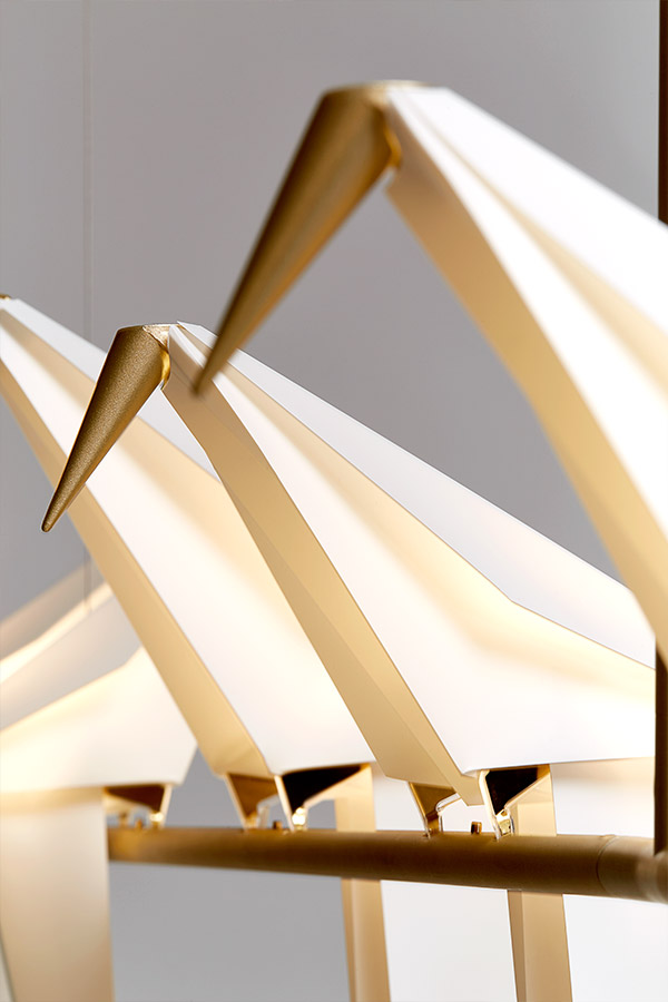
Moooi are known for the bold and the unexpected, hosting a collection of designs that instantly bring a smile to our face. The beautiful Perch Light is no exception. Inspired by nature, this is a lighting collection that blurs the boundaries between art, architecture and product design – creating a piece like nothing else we’ve seen before. After all, what’s more poetic and elegantly captivating than a bird perched on a branch – flirting, singing and celebrating life?
We virtually caught up with Umut Yamac, designer of the Perch Light - talking inspiration and collaboration, alongside some tips on how to light our homes.
When did you first know you were a designer?
I can trace the starting point back to my Art lessons at secondary school. It was a very free environment compared to other subjects, and one that operated at a different pace with the freedom to explore. This is when I first realised that ideas can be translated into things, and at the time this was mostly paintings.
We’ve read that you studied Architecture at The Bartlett before working for a number of internationally renowned architects. What drove you to make the transition from architecture into product design?
For me, this was a very natural progression. Studying at the Bartlett, it was a very arts-based course, and the focus was on the exploration of the design process. The outcome of this was sometimes a building, but very often it wasn’t!
During my studies there I spent most of my time in the workshop, arriving as soon as it opened and staying until it closed, even sweeping the floor at the end of the day to get a bit of extra time and buy favour with the technicians.
After graduating I worked for a number of architects on projects at very different scales, but eventually, I realised that I wanted to return to the scale of working with my hands-on projects at a smaller scale and decided to set up my practice centred around a workshop. Ultimately, I think the two disciplines, whilst being different in many ways, are complementary and the design process is interchangeable.
You describe your pieces as ‘exploring the middle ground between architecture and light’. Could you expand on what you mean by this?
In my mind, architecture, light and space are all intrinsically linked. To create a beautiful space, you need to consider the light, whether that’s natural or artificial. Likewise, I think that to design lighting you also need to think about the space and how it’s occupied. With my pieces, I set out to do this, but also create to create some dialogue between the two in the form of movement. Having a kinetic element to the work, be it physical or visual, brings it to life and creates a dialogue between the architecture, user and the light which is a really interesting territory to explore.
Perhaps your most well-known design is the beautiful Perch Light. How did you come up with the design?
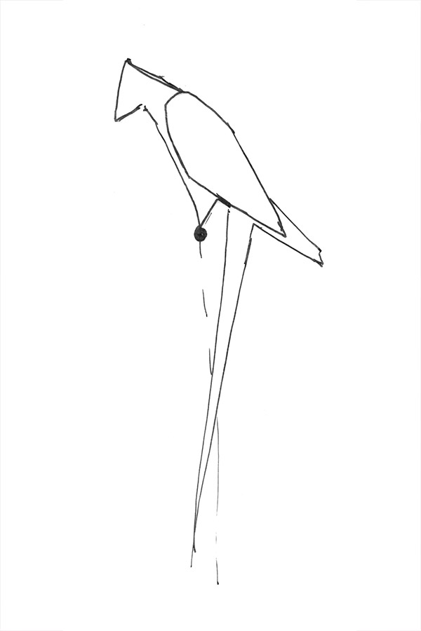
The Perch was the coming together of a number of interests: kinetic sculptures, birds and paper.
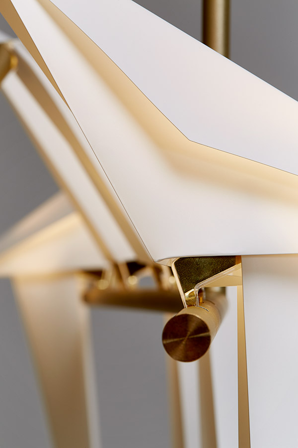
I was always fascinated by kinetic and balancing objects, especially those that use a simple mechanical principle. Inspired by some of these early toys I had made a balancing sculpture (a conceptual broadcasting aerial for Wilton’s music hall!) that balanced on two feet and used a counterweight to balance and sway. Using two feet as the contact points gave me the idea to work with light and express the polarity of the electrical supply and explore how something that sways can maintain an electrical connection.
In tandem with this, I was exploring birds as a theme because I think they are a creature that you can have an emotional connection with. Whilst growing up, certain birds who were frequent visitors to the garden were said to be relatives who had passed away, dropping by to check in with us. I love this idea that birds can be connected to people past and present, familiar yet fantastical.
The paper material was a way to bring these two elements together in a very lightweight form, which was both a shade/diffuser and a vessel for housing counterweights to control and balance the movement.
And how did your collaboration with Moooi come about?
Once I had developed the Perch prototypes, I exhibited them on a very small stand at Design Junction. By chance, they caught the eye of Casper Vissers, Moooi co-founder, and we started the conversation from there.
Many of your pieces seem to be inspired by nature. Where do you find inspiration? Are there any people, places or things which always fill you with ideas?
I tend to find inspiration when I’m in motion. At the moment it’s mostly on my bike around East London, but when we were more mobile, I really enjoyed travelling to and from meetings. The journey is a time when your mind can wander with the landscape and somehow it feels more relaxed and open new thoughts and ideas.
The Perch Light is a whimsical lighting system that can be adapted to suit a number of forms of lighting. From pendants, to floor lamps - the right lighting is absolutely pivotal to the feel of a space. In your opinion, how should we be illuminating our homes?
I think lighting is a very personal choice. I would suggest choosing lighting that resonates with you. Something you will enjoy sharing your space with, something made to last. It may be more expensive, but it will be a good investment.
For me, warm light is softer and more welcoming than cool light, and perhaps more suited to the cosy spaces of the home. I think it’s interesting to have a number of possible light sources in a space - floor, wall, table etc – rather than relying on a single one. This gives the option to create different moods for different scenarios, but also different light levels.
Some lighting can be very bright, especially if the light source is visible, so I think it’s good to explore diffused light and fittings that are dimmable.
We’ve all been spending a lot more time at home over the past few months, leading many of us to reconsider how our spaces work. Is there anything you think the design and furniture industry can learn from the current crisis?
With more time spent at home, and more activities taking place at home – working, homeschooling, living – design which incorporates more adaptability to different uses would be hugely beneficial and be a more efficient use of space.
Also, with the postponement of the large design fairs in the last year perhaps this is an opportunity to consider the cycle of launching new products. How much new design is needed, and how often?
What’s your favourite item in your home and why?
My favourite possessions are a couple of screenprints by artists Escif & RUN. I like them because they mainly paint walls, and the print is a way to enjoy their work at home and support their practice.
What’s next for you?
I recently collaborated on a large-scale outdoor artwork incorporating light, so this is an area and scale I would definitely like to continue exploring.
I’m currently working on a couple of collaborations which are in development, but too early to say! I am also working on some new studio collections which I hope to reveal later in the year. Watch this space!
Discover more about Moooi’s stunning Perch Light Collection here. Do you own a Perch Light? Share your styling with us over Instagram @nest_co_uk.


