Inside your homes: Adam & Katie Barclay
Connecting with customers and exploring their homes always brings us so much joy. We are constantly surprised and inspired by the spaces created in your homes.
A home should represent you and how you wish to live - something very much apparent in the unique spaces of @in_grid_studio founders Adam and Katie Barclay.
Earlier in the year (before social distancing measures came into place) we visited the couple’s Sheffield home to see exactly how they’ve styled a variety of Nest favourites and chatted to them about why they are drawn to design classics.
What were your intentions when curating the space?
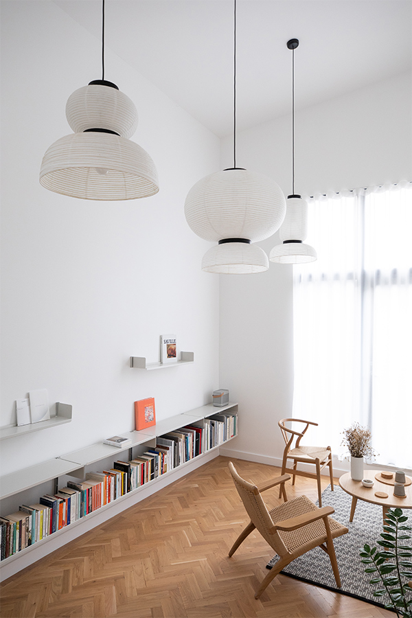
We both like simple and refined spaces that leave a lot of room for thinking and dislike living amongst too much visual noise. This meant when curating the rooms with items of furniture we wanted less, but what we did buy had to be truly beautiful.
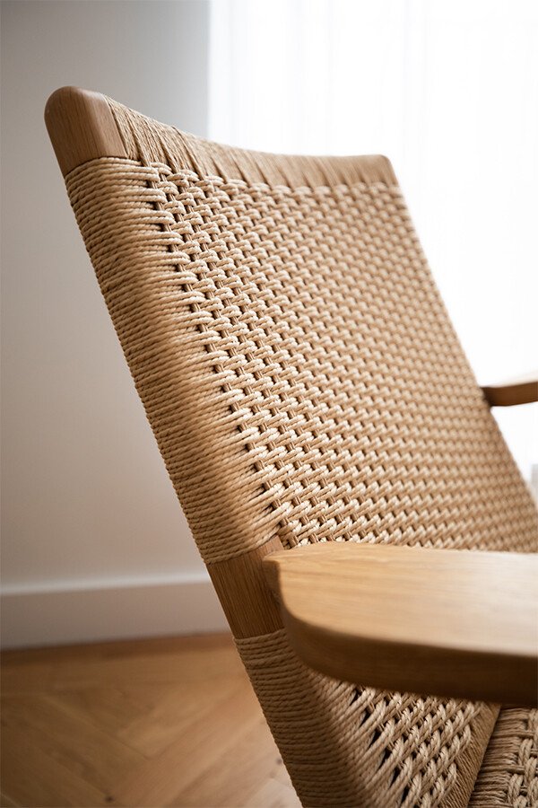
Pieces like the CH25 Chair by Hans Wegner is a chair of such beauty and individuality we felt we had to celebrate that and allow it to be the central figure within the room. Then around that, we curated support pieces that had a more quiet elegance, like the Jasper Morrison Soft Modular Sofa. This allowed for continuity within the room, without designs fighting for supremacy with the eye. This was a rule employed throughout the house.
Do you notice commonalities in the types of design you appreciate? What qualities do you look for?
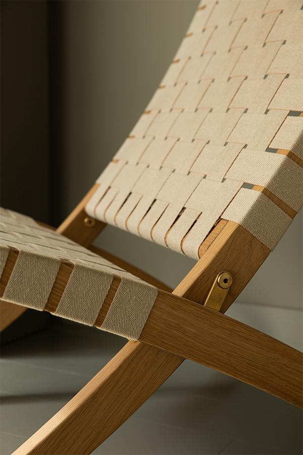
I think when searching or evaluating whether a piece is right for our space we often think about its materiality and construction first. We like pieces to be finished in natural materials like Oak or Ash. Visually we want them to appear light, both in weight and thickness, for example, a subtle and refined chair leg. Light should be able to pass through the structure easily, lessening the pieces visual impact resulting in something extremely elegant.
We also gravitate towards pieces that look simple in their construction even if the joinery is actually very complex. This type of design and construction is very exciting to us, as it is the same approach Katie takes when designing the clothes for our brand in-grid.
When it comes to the designs you have selected - how were they chosen?
My interest really began to take hold when I got my first design job at a creative agency in London called Bibliotheque Design when I had turned 20. The three partners who owned the company had an impeccable collection of furniture, from vintage Poul Kjaerholm to pieces by Maarten Van Severen, Arne Jacobsen etc and they were extremely enthusiastic in sharing that knowledge. They were called Bibliotheque simply because they had a huge library of books. When the office was quiet you were encouraged to adventure through these books and forge an understanding of your own.
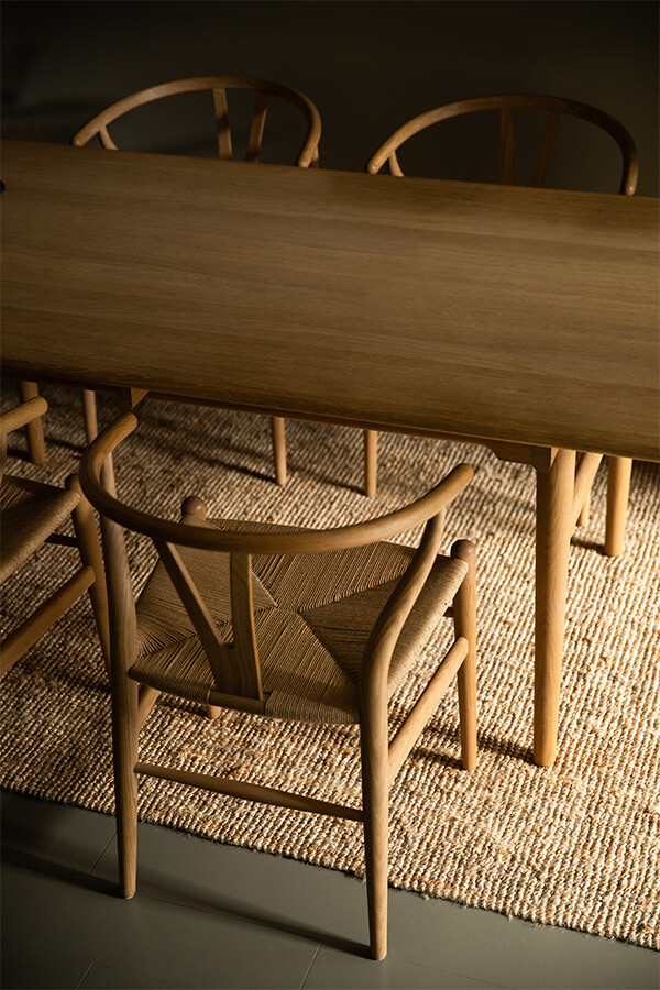
When I was 21 my parents kindly bought me a black stained Hans Wegner CH24 (wishbone) chair for my birthday. This was the first piece in my collection, later that year I bought an ex-display George Nakashima Straight Chair with a bonus I received.
So my taste in design was forged early on and has only grown in the last 10 years. When it came to the point where we could afford to invest in more pieces, it was not really a big choice, we both already knew what we wanted.
With the lighting you chose, what were the overriding factors in the decision?
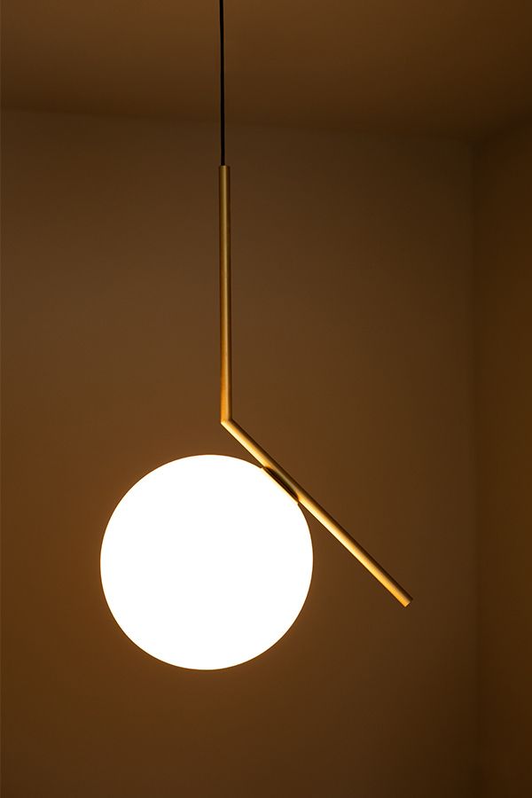
Simplicity, we did not want any designs that we found too fussy in their creation or too statemental. They needed to have a defined graphic character with subtle yet elegant materials.
Another very important factor is the quality of the light itself. We both love the atmosphere that a softly diffused, warm light emits. Light like this almost has the same romance as candlelight. As a photographer, I always search to light my images in a very similar romantic manner, so it only feels natural to light my home in the same way.
You are a collector of design classics – what is it that draws you to design icons?
There is something beautiful about a piece of design that can stay relevant since the late forties or fifties in a world where weekly change is a given. We wanted to find pieces that had a rich history within design, but could also go on their journey within our home/homes for another 40 or 50 years.
Do you have any further plans for the space? What can we expect from your interiors?
We have several plans, and in the past we have had some rather bigger plans that unfortunately did not come to fruition due to an over-controlling hand from the developer.
One plan was to make use of the high ceilings by constructing a mezzanine in the living room to act as a reading room, a quiet space where we could digest the books we loved. We had lined up an architect to design and build something of real merit. But as I say this did not come to fruition. But right now I think we would like to strip out the kitchen and create a more quiet kitchen area, almost hidden from view making the kitchen/dining room fit for purpose but with a more rarified un-expected approach.
We are also planning to turn the second bedroom into an office, that is inspired by Alvar Aalto’s architectural office in Helsinki.
After curating your home how does the space and living within it make you feel?
We simply wanted to create an environment that had a calming effect on us and that worked with the architectures strongest attributes, like the high ceilings.
We felt the best way to create a calming space was to have nothing (other than lighting) above average eye-line. This really exaggerated the height of the room leaving a room feeling somewhat rarefied and in some ways monastic.
You live in a house in Little Kelham - an award winning site with stunning heritage. What is it about the layout and style of the space that drew you to it?
It was one crucial element: The ceilings. We found it incredibly rare to stumble across a new build that had a ceiling height of 5 metres. We happily passed on a property with more bedrooms so we could claim that space.
For us, we find more space within a home inevitably fills up with furniture or any other object acquired through life, but ceiling space is protected from such hoarding and can allow for an exceptionally peaceful and almost monastically calm environment.
Adam Barclay
Photographer, Director and Set Designer


